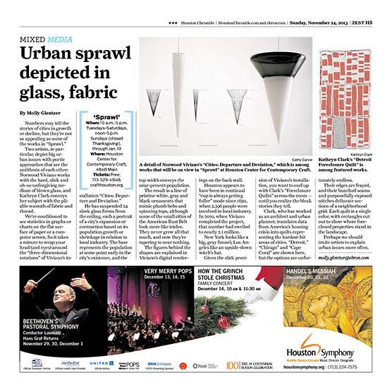
Numbers may tell the stories of cities in growth or decline, but they’re not as appealing as some of the works in “Sprawl.” Two artists, in particular, depict big urban issues with poetic approaches that are the antithesis of each other: Norwood Viviano works with the hard, slick and oh-so-unforgiving medium of blown glass, and Kathryn Clark conveys her subject with the pliable warmth of fabric and thread.
We’re conditioned to see statistics in graphs or charts on the flat surface of paper or a computer screen. So it takes aminute to wrap your head (and eyes) around the “three-dimensional rotations” of Viviano’s installation “Cities: Departure and Deviation.”
He has suspended 24 sleek glass forms from the ceiling, each a portrait of a city’s expansion or contraction based on its population growth or shrinkage in relation to local industry. The base represents the population at some point early in the city’s existence, and the top width conveys the near-present population. The result is a line of pristine white, gray and black ornaments that mimic plumb bobs and spinning tops, although some of the small cities of the American Rust Belt look more like icicles.
They never grew all that much, and now they’re tapering to near nothing. The figures behind the shapes are explained in Viviano’s digital renderings on the back wall. Houston appears to have been in continual “cup is always getting fuller”mode since 1850, when 2,396 people were involved in local industry. In 2010, when Viviano completed the project, that number had swelled to nearly 2.1 million. NewYork looks like a big, gray funnel; Los Angeles like an upside-down witch’s hat.
Given the slick precision of Viviano’s installation, youwant to curl up with Clark’s “Foreclosure Quilts” across the room—until you realize the bleak stories they tell. Clark, who has worked as an architect and urban planner, translates data from America’s housing crisis into quilts representing the hardest-hit areas of cities. “Detroit,” “Chicago” and “Cape Coral” are shown here, but the options are unfortunately endless. Their edges are frayed, and their bunched seams and purposefully exposed stitches delineate sections of a neighborhood grid. Each quilt is a single color, with rectangles cut out to show where foreclosed properties stand in the landscape.
Perhaps we should invite artists to explain urban issues more often.


