By Joseph Wozny

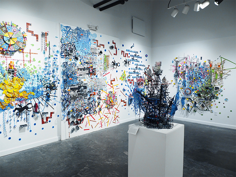
From across the room, Nathalie Miebach’s wall pieces trigger a vague sense of recognition. In the center of a Harvey’s Twitter SOS, a piece featured in her show The Water Line at the Houston Center for Contemporary Craft, a blue patch is filled with red, white, and yellow dots. This rough map is a translation of data published by the New York Times after hurricane Harvey. The dots are areas where people sent out calls for help on Twitter.
Data maps, along with other forms of data visualization, a newish part of our mainstream news literacy, use color contrast to help us comprehend vast quantities of information, giving us a sense of the situation from those thousands of individual data points. Mapping is a vehicle for Miebach. She manipulates the visual aspects of how we make sense of these visualizations. An online interactive on the New York Times website is a two dimensional projection; she transforms this into a three dimensional object, going beyond what we understand to ask about how we understand. She is a basket weaver, and a map is not unlike a basket, it could be said to be full of longitudes and latitudes.

It was Miebach’s interest in science that led her to become a sculptor nearly two decades ago. She says, “Sculpture was the method I used to answer specific questions I had about science. The work was very didactic and meant to provide an answer to a scientific question.” Her work focuses on weather data. Tied to climate change and devastating storms, it is full of powerful emotional connotations for people. Over time, her work began to incorporate these metaphors and meanings. This is the other side of the work, the weaving in of narratives. The dots on Harvey’s Twitter are messages sent out by people; each one of those people had a unique, complete, and emotional experience of that storm.

Around the blue area in Harvey’s Twitter, radically different terrains border on all sides. The mangled remains of rafts of a green sea border to the east; houses and cranes littered with pink float to the northwest; structures hang over nothing to the south; the map is breaking down along with whatever simple sense of understanding a map might possibly offer. Her colorful works overload the eye, causing pause and inviting closer inspection. There are references to carnivals and rides, which seem both playful and foreboding. Miebach says, “The sculptures and wall pieces are more nuanced, more laden with metaphor and more open-ended to encourage the viewer to come up with their own questions and answers.” Her expansive transformation of data resists any technocratic zeitgeist and instead opens up a curiosity about what our experience is.
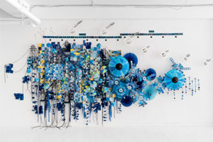
Another strategy for exploring the intersection between art, science, and people is the translation of data into musical scores. In her watercolor score for the Burden of Every Drop, a key indicates colors for levels of rainfall like a map. Time is mapped out on different scales; other numerical data on the map remains elusive to the viewer. Sharing her score and the data its made from, she begins a collaboration with a composer. While they render their musical interpretation of it, she builds the sculpture. She says, “Every musical interpretation gives me another example of how someone else has approached the same base material. It invariably changes the way I build future musical scores. Every collaboration is different.”

This musical strategy brings in another dimension of emotion that might not be obtainable in other artistic means. So far, Miebach has done 12 commissions for scores. The next concert, The Water Line Concert, will take place Dec 5th, 2019, at the Houston Center for Contemporary Craft. This performance of Harvey Twitter SOS is a collaboration with composers Kyle Rivera and Shane Monds, and will be performed by the KINETIC Ensemble.
The Water Line has works based on Hurricanes Harvey, Irma, and Maria. The Burden of Every Drop based on Hurricane Maria, which devastated Puerto Rico, combines news stories with scientific data. Like a storm, the piece changes form as it moves forward. As the types of data change, so does the texture, creating a path from tightly organized circles to disparate threads, as it hits its final destination.
Seen together, the pieces in The Water Line generate curiosity about their construction. They are purposefully inviting, leaving plenty of intricate macro details for close inspection. The weather metaphor is conveyed in hints, which viewers piece together as they navigate the exhibition. Weather, traumatic or not, leaves people with complicated feelings. Miebach invites us to slow down, inspect, and connect with the big questions that loom over our world. Talking about the weather would not then be small talk.
-JOSEPH WOZNY


